BRIGHT ON WHITENING PACKAGING

CLIENT: SMILEDIRECTCLUB

Notes:  Who doesn’t love white teeth, especially when it comes to fun packaging? SmileDirectClub expanded their reach by coming up with a whitening formula called Bright On™. Bright On needed branding that would not only stand out in stores, but would also have a similar branding style as SmileDirectClub, yet different enough that it could stand alone. The task was to design 3 different boxes – each for a different duration of whitening treatment – that could be sold as individual products or put together and sold as one unit. This entailed creating the branding for the Bright On packaging, designing the packaging, custom designing vac trays, into which the products fit, art directing the photoshoot of the products and illustrations. There was a bit of extra room in the budget to apply both foil stamping and spot UV to the printing process, which was a ton of fun to experiment with.

A package of three toothbrushes on a white surface.
Three boxes of a product sitting on a white surface.
A box with a bottle of water next to it.
A box of bright ne is next to a green leaf.

Bright On Instructions

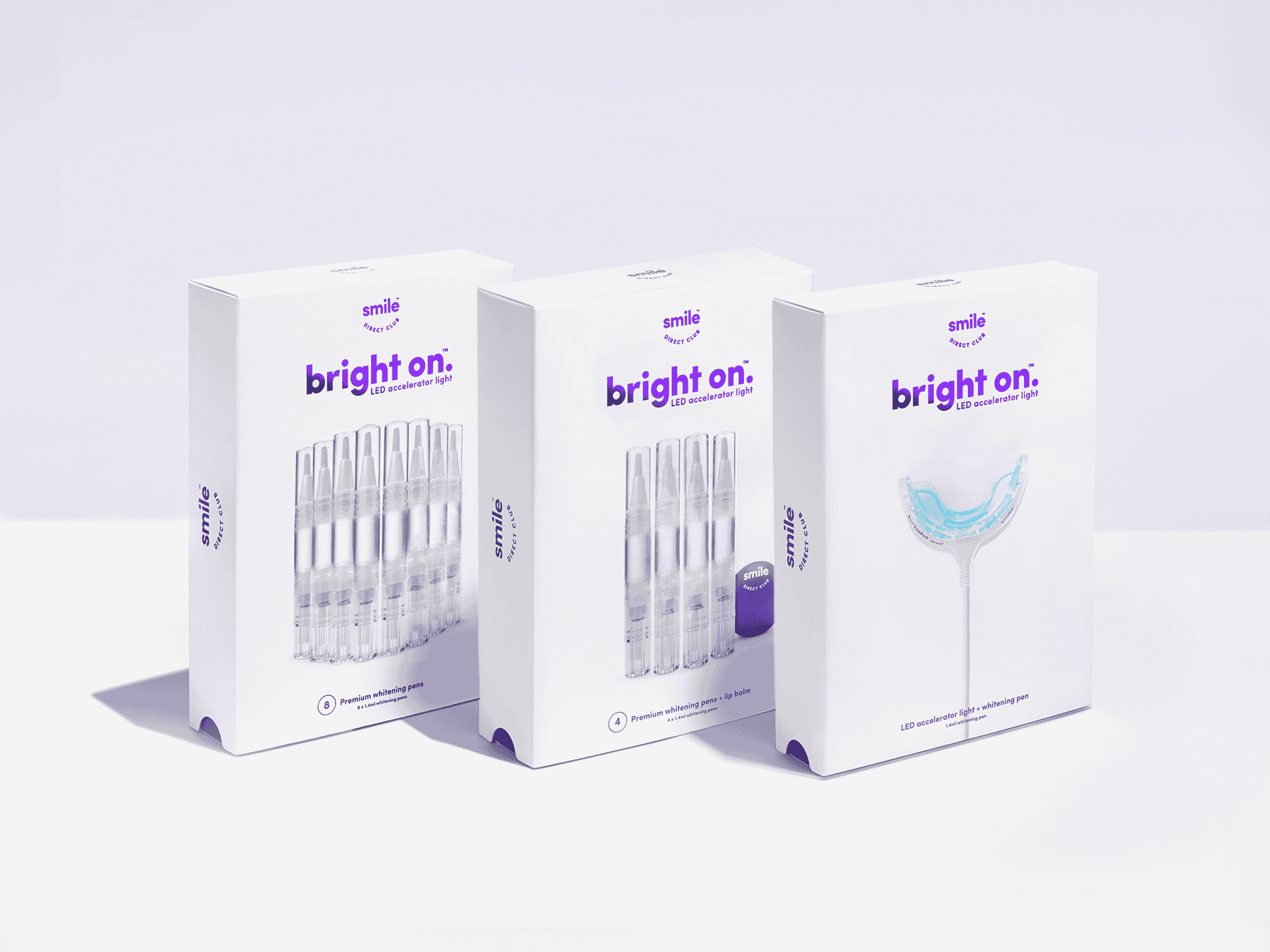
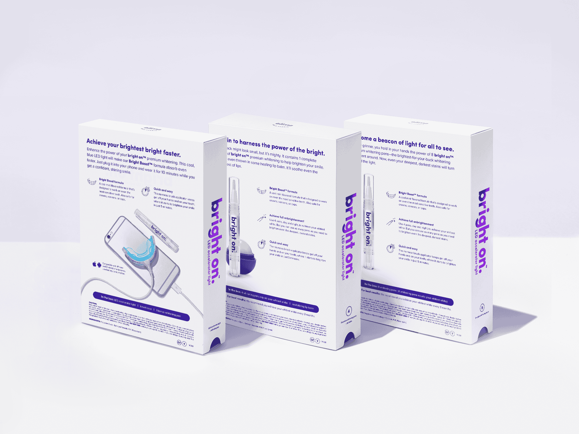
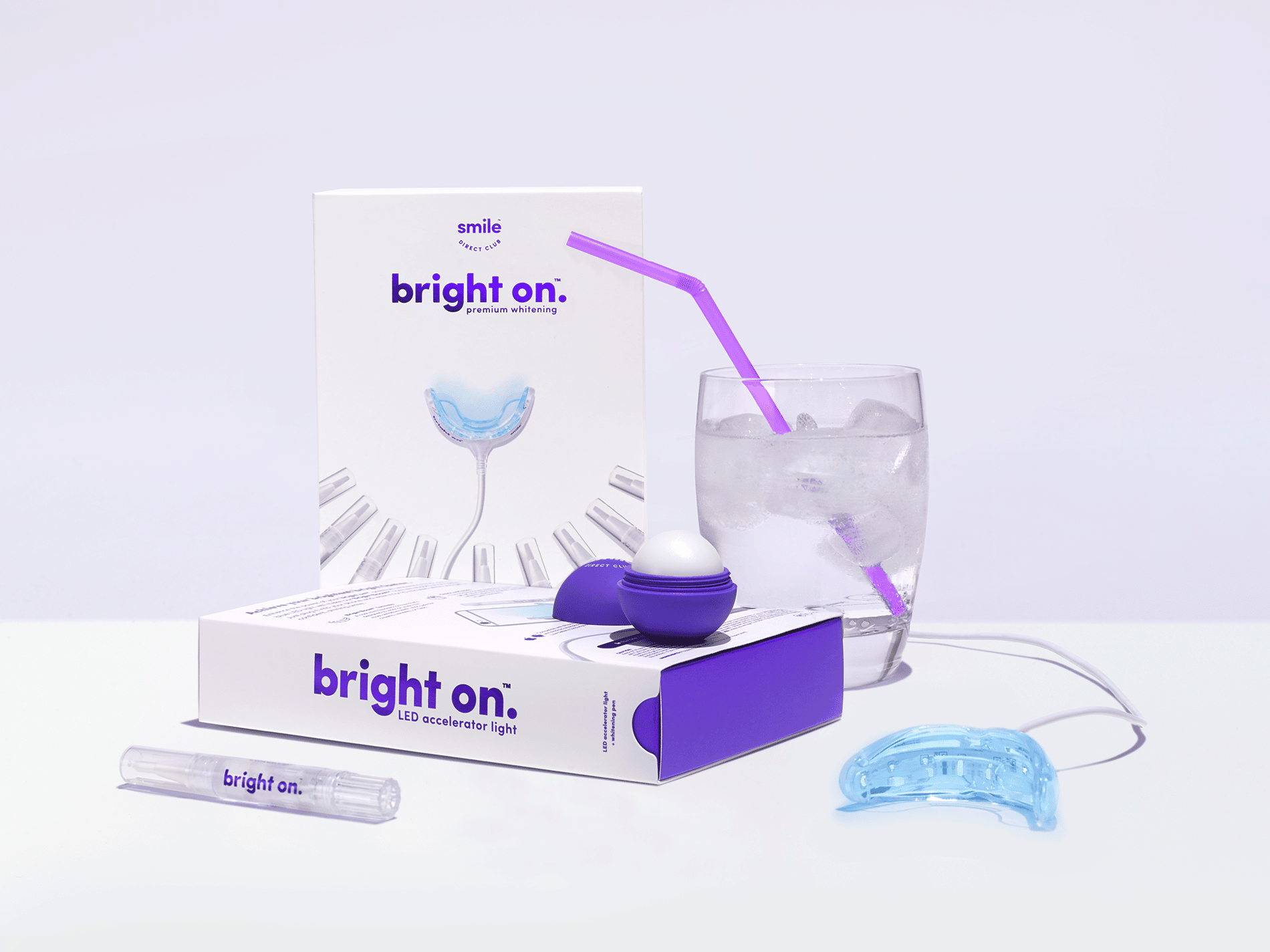
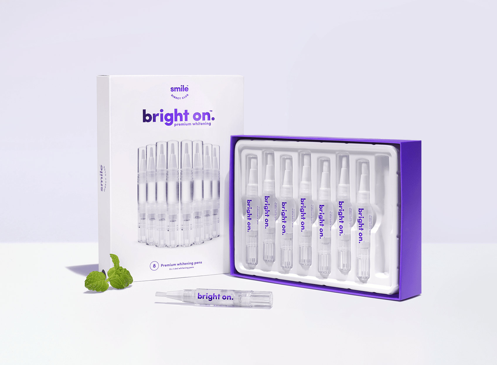
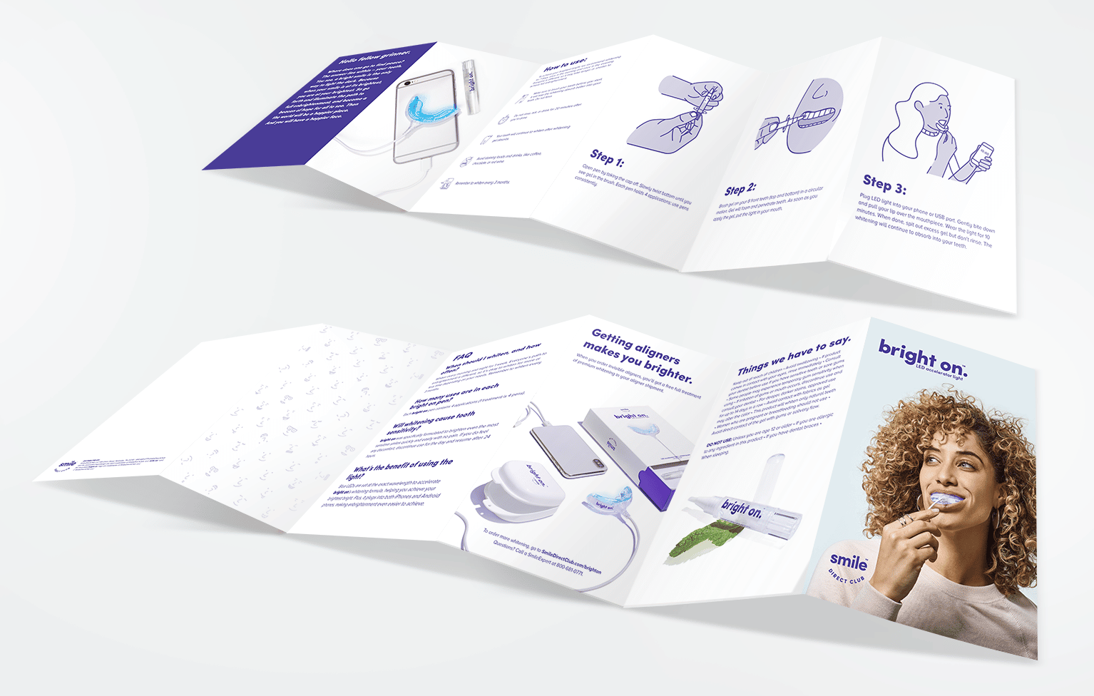
Notes:  This 12 panel guide explains each step of how to use the Bright On whitening kit, which includes simple instructions supported by easy to follow illustrations, FAQs, and support information. Each Bright On box includes this 12 panel instruction guide.
A brochure with a woman using an electric toothbrush.

Let's change the way people perceive your brand.

Let's change the way people perceive your brand.